Engagement Fund: Agricultural Correlations from Open Data - John O'Brien, Creme Software
17 Iúil 2017Overview
The aim of our project was to make it easier to explore agricultural open data and thereby increase public engagement with the data themselves and with the open data project generally.
We downloaded the most relevant of the more than 100 databases stored under the Agriculture, Fisheries, Forestry and Food section. Although in the data.gov.ie site many of the databases are only stored as .json or .px files, we found most of them are available as downloadable csv which are easier to study.
We divided the databases into categories depending on the data stored; livestock, crops, fish and economic data (land values, employment rates, etc.). After that we started with the data sets with only one dimension as these represented the simplest cases to explore. With enough time we would add the other databases, so that we could also include, for example, the geographical dimensions, until all datasets were included in the application.
Workplan
We started by downloading all the databases we needed to study their content and to investigate methods of displaying that content and how we could offer the public a tool to explore it.
Creating the interface
As we say, our first version works with databases that have only one dimension, and our interface asks for two of these databases (but of course the user can choose to compare two variables from the same database).
After choosing the two databases the interface asks for the variables within each database to be shown in the graph.
Drawing the graph
To draw the graph we combine the years included in both variables and we create the x-axis from the lowest year to the highest.
We create two y-axes, one for each chosen variable, allowing the users to compare data in a single view and to extract conclusions.
We also include in the y-axes the units of each variable and, in the upper corners, a legend describing the variable each line in the graph represents.
Finally, at the bottom of the graph we use the labels of two databases to name the graph and to describe the data the graph shows. In this case we simply applied, without any modification, labels stored in the databases. From inspection of a few examples, these label fields are in some cases not succinct, and in other cases are ambiguous. The addition of appropriate annotations as part of the curation process would be very helpful in encouraging use of the data in applications like ours.
Conclusion
We created a platform that allows the users to compare different variables more easily than by browsing the CSO or data.gov.ie sites, because we can show in the same graph data from different databases and because the variables are thematically arranged.
We make no attempt to offer an interpretation of the plots produced by our application, leaving this to the user with relevant domain knowledge required. As examples, we show a few graphs in the following pages.
We should stress that these are only examples and that, in its current version, the application holds data for 63 variables from 10 different databases. This means that there are 3,906 possible graphs that can be produced and explored.
Farms and Dairy Cows

In this case we can see a decrease in numbers of dairy cows slightly in advance of a fall in the total numbers of farms.
Farms and Bulls

In contrast, while farm numbers decline, numbers of bulls increase.
Value of Crab in landing and in market
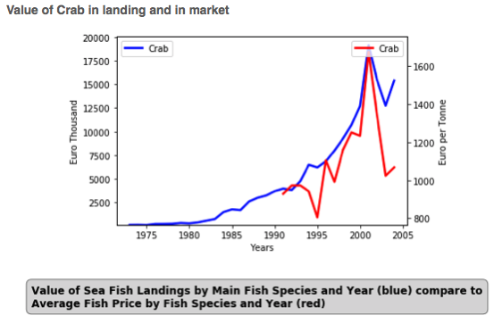
The relationship between value of landed catch and market price seems to broadly match for crab.
Value of Cod in landing and in market

In the case of cod, the two variables seem scarcely to be related to each other at all.
Resources
Following the open data principle, the code used for this application is also free for download for consultation and/or modification. The repository is here:
https://stash.cremelabs.com/projects/OD/repos/agricultural-correlationsin/browse
John O'Brien, Creme Software
 Derilinx