How to Convert Your Dashboard into a Report
This guide helps you convert your dashboard into a report by adding a header, a description/markdown text, and dividers to it.
With a header, you can add multiple headings to your dashboard in different sizes, such as H1, H2, H3, and so on.
With Text/Markdown, you can include a description/markdown text that explains the dataset used to create the charts and visualizations in the dashboard. Additionally, you might want to add any insights gained from the charts. Feel free to be creative with the content you decide to include in the dashboard.
Using a divider, you can separate the dashboard into sections, similar to the "Sunshine, Temperature, and Rainfall (1958-2022)" dashboard we are exploring below.
That was a quick definition for half of the layout elements available for dashboard in apache superset. Lets get into how to work around them.
1. From the top left of the navigation bar of the website, click on "DATASETS".

2. Type in your dataset name, for example, "mtm02".

3. Click on the "Search" icon button.

4. Once the search is clicked, the list of datasets that matches the keyword entered lists below with the top matched at the top.
To understand what is being displayed for each dataset.
On the right, first, you have the theme of the dataset. Below that, you have the types of dataset resources added to the dataset "MTM02 - Temperature". Next to that, there is a 3 out of 5 stars provided for the datasets for its openness. And at last, the number of views that the dataset has been viewed so far.
On the left, first, you have the title of the dataset, which is also the hyperlink to the dataset itself. So to view it, you just click on it. Below that, the publisher of the dataset. And then, the description provided for the dataset.

5. Click on the specific dataset, for example - MTM02 - Temperature
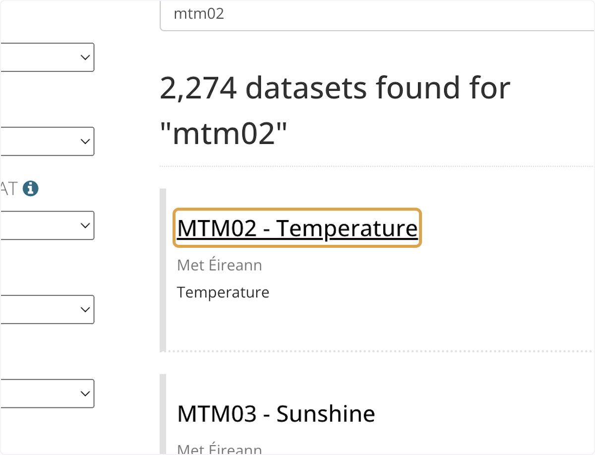
6. Click on "Sunshine, Temperature and Rainfall (1958 - 2022) - View in Superset".
In the dataset's main page, the dashboard should be available right below the description of the dataset. And, to view the dashboard in the superset side of the portal, click on the hyperlink "Sunshine, Temperature and Rainfall (1958-2022) - View in Superset".

7. To add/edit/delete anything in the dashboard, from the top right of the dashboard, click on "Edit dashboard".

8. To view all the elements that can be added to the dashboard, click on Layout elements.

9. Drag a specific element - for example, "Header" and drop it in the golden line.
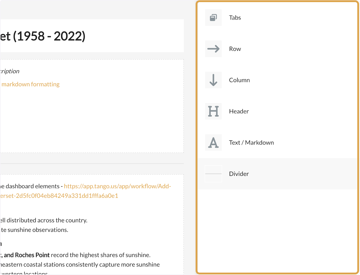
All the layout elements are available in there. Quick review of the elements:
Tabs - to create multiple tabs of various set of charts in one dashboard.
Row - to add a row to the dashboard that will help in adding more charts.
Column - to add a column to the dashboard that will help in adding more charts.
Header - to add header(s) to the dashboard in different formatting.
Text/Markdown - for large text, such as insights and explanations of the datasets.
Divider - to add a line/divider to sectionalise the charts in the dashboard.

10. For example, type "Sunshine dataset (1958 - 2022)".
The formatting of the header can be modified in size (Small, Medium, Large) and their background (Transparent or White background).

11. Click on "Transparent background" dropdown to change the background of the header.

12. Click on "White" to add white background to the header.

13. To adjust the size of the header, click on "Medium" dropdown.
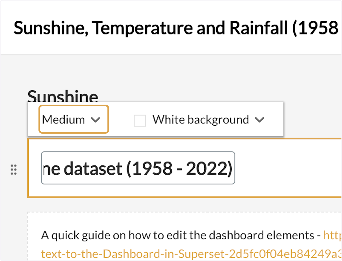
14. Click on "Large" to change the size of the text.

15. The final result would look something as below.

16. Drag a specific element - for example, "Text/Markdown" and drop it in the golden line.

17. Paste "**Sunshine** Dashboard with *description*" into Text / Markdown box dropped into the dashboard.

18. For quick understanding of how to write in markdown formatting, click on the markdown formatting hyperlink.

19. So once it is done, the markdown will start looking like this.
So **Sunshine** for bold and *Description* for italic and many more would be available in the guide above.

20. Drag a specific element - for example, "Divider" and drop it in the golden line.
And the dashboard would have the line acting as the divider between the charts and the header and description.
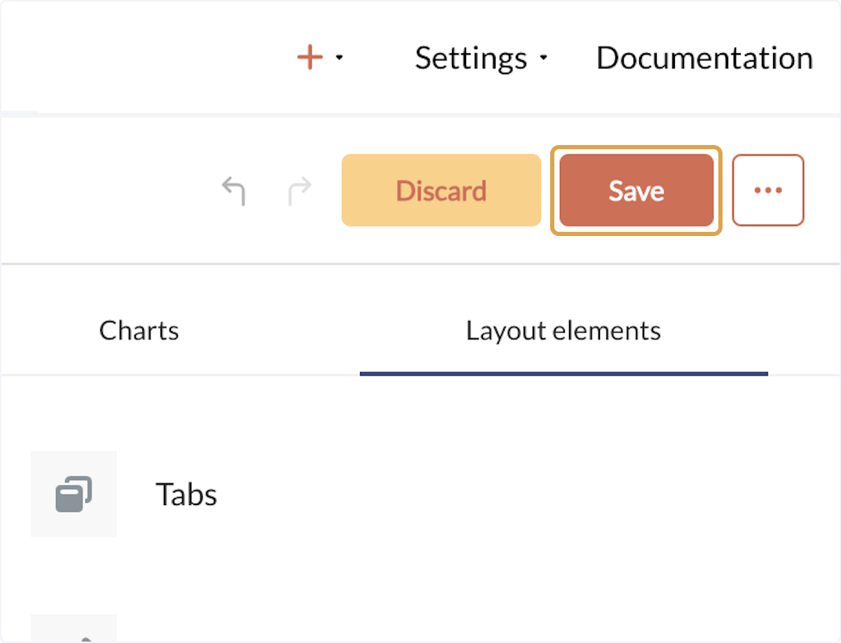
21. Once you have made all the changes needed in the dashboard, click on "Save" from the top right of the dashboard.
22. The final look of the dashboard having a header with white background, a text description and a divider.

23. To quickly copy the link to the dashboard, click on "Copy URL" icon button in the header.
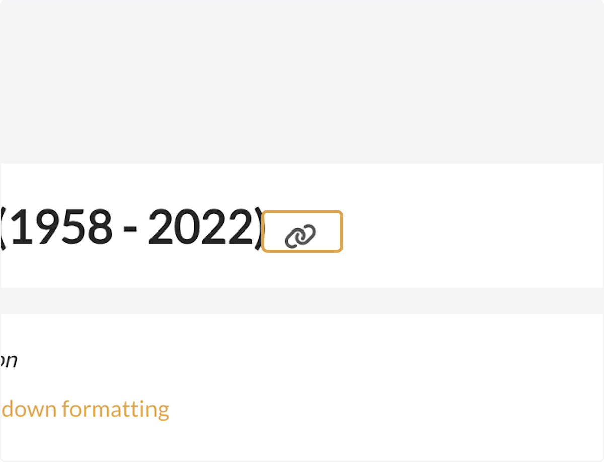
24. Click on the "Copy" icon button, that shows up in the pop up.

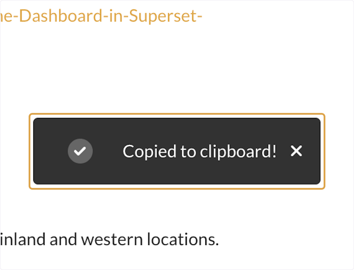
25. The link is now copied to your clipboard to paste it anywhere.

 Derilinx